The Sketch
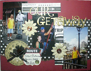
Alecia's Example - Our Getaway - I love the polka dot paper against the red. And all the embellishments she added really gave the page dimention. The "Route" journaling tag really makes it a travel page and that font is really cute.
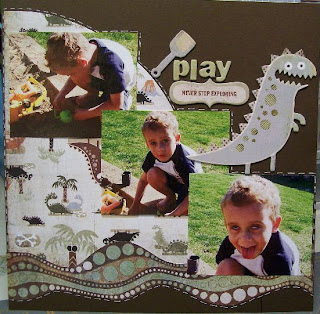
Bethy's Example - Never Stop Exploring - I love all her doodling and the paper she chose was perfect for this page. The three pictures really show the funny and serious faces of her adorable son!
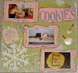
Heather's Example - Cookies - I love the torn edge frames for the pics and title. And those ghost snowflakes really add some sparkle to the page. The mixer and whisk are really cute embellishments for this cute page.
Pat's Eample - Play Hard - I love her long arrows with the 3 brads on them pointing to the title, it really leads you around the page. And the polka dot pattern repeated in the frames and brads really give the page a uniform look.
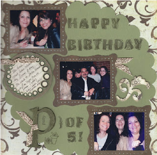
Gina's Example - Party of 5 - I love the colors she used on this layout. And the hand doodling around the frames really adds a nice touch.
My Example - Out To Pasture - I had alot of fun with this sketch. The wrap around vine pointing to the title, the gold doodling on the circle, frames, and letters really helped to bring out the pictures.








1 comment:
LOVE everyone's layouts ladies!! Fabulous work as usual!!
And thanks for another ROCKIN' sketch Jessica!
Post a Comment